Data Table What-If Analysis in Excel

Using What-if analysis is performing Sensitivity analysis using excel on a set of data, where we want to see a range of possible outcomes based on certain changing parameter values. This analysis allows a decision maker to take more informed decisions.

There are three different tools available in Excel to perform what-if analysis: Scenarios, Data tables and Goal Seek. Of these, we will be looking at “Data Table” based What-If analysis in today’s article. We can perform a One Variable What-If Analysis, as well as Two Variable What-If Analysis. What this means is, that we get to see an outcome on the data set by changing a maximum of two variables, called decision variables. (Some people may call decision variable as an independent variable).
The key is that the outcome for which we are trying to perform a What-if analysis should be a formula containing the decision variable(s).

Let us see each of the above in action.

One Variable Data Table What-If Analysis

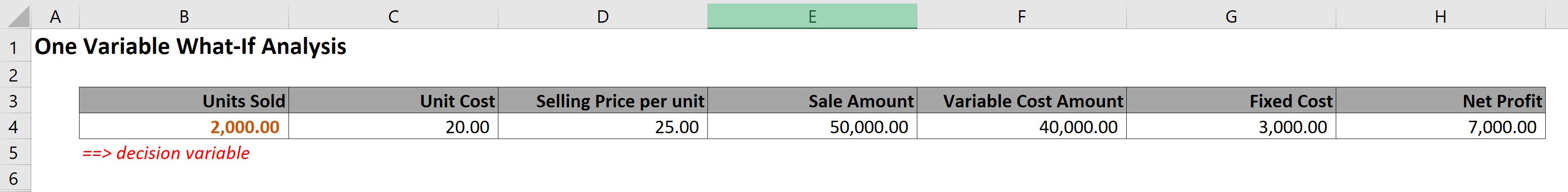
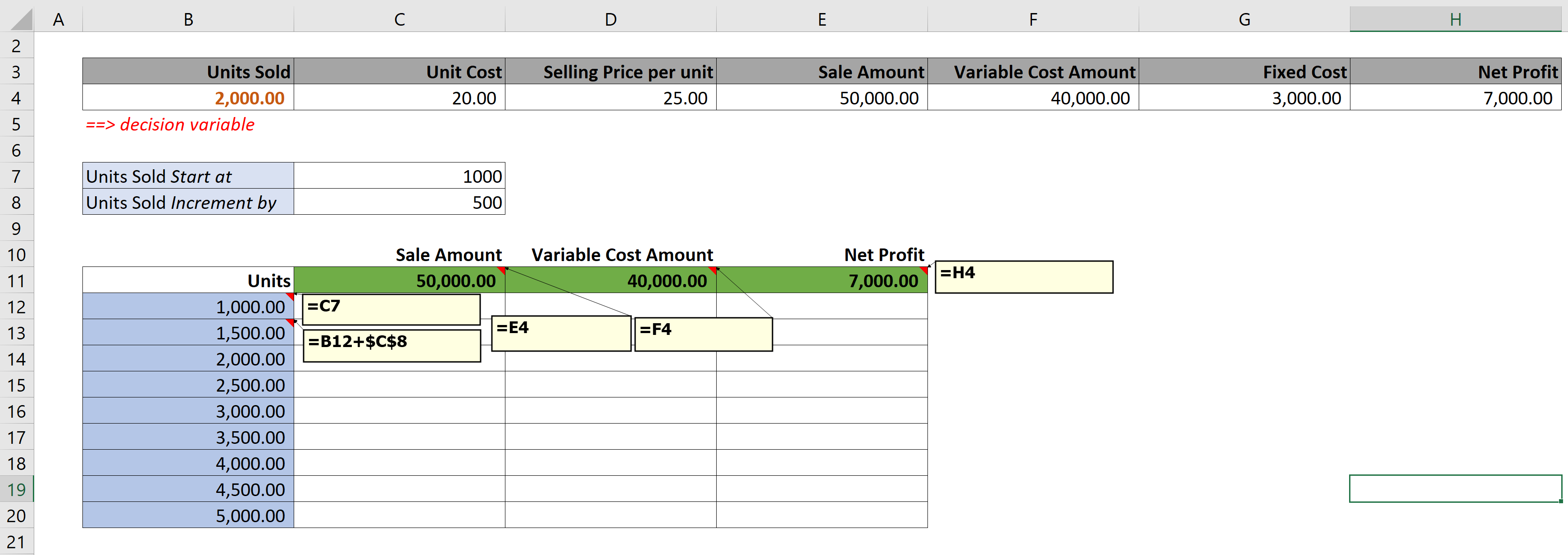
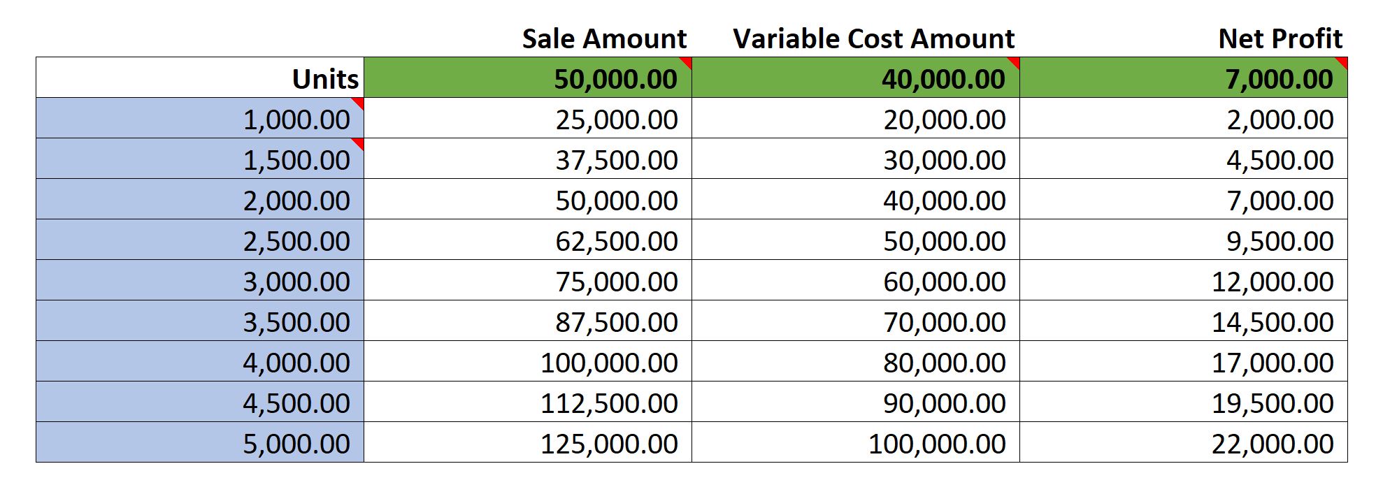
Let us take an example where we have a sample data set that consists of columns such as the Units sold, the Cost per unit, the Selling price per unit, the Variable cost, the Sale amount, the Fixed cost and finally the Net Profit. In our example, we will take the “Units sold” as our decision variable and we will perform a what-if analysis on the outcome which is the “Net Profit”.

Step 1

Lets put the data set as shown below.

Data Set

Step 2

By changing the input value (aka the decision variable) which in our case is “Units Sold”, we will see how different inputs values will impact the results – the Sale Amount, the Variable Cost, and finally our main goal the Net Profit.

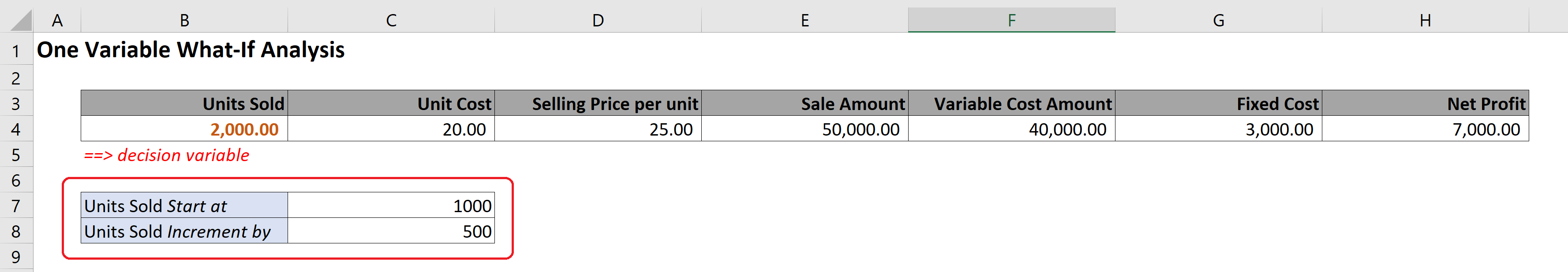
We will be setting up our input variable box, which will have certain arguments that will allow us to change the range of Units Sold, and this will allow the input range more flexibility. I will explain this in more detail once we have completed the scenario.

Input Variable Box

Step 3

In this step we have to setup the matrix of data table that we need. Lets understand how this matrix is built.

Matrix for Data Table

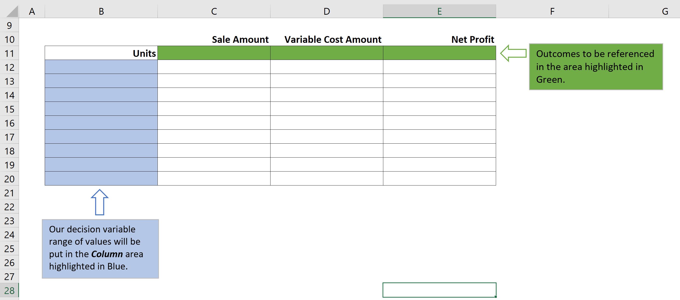
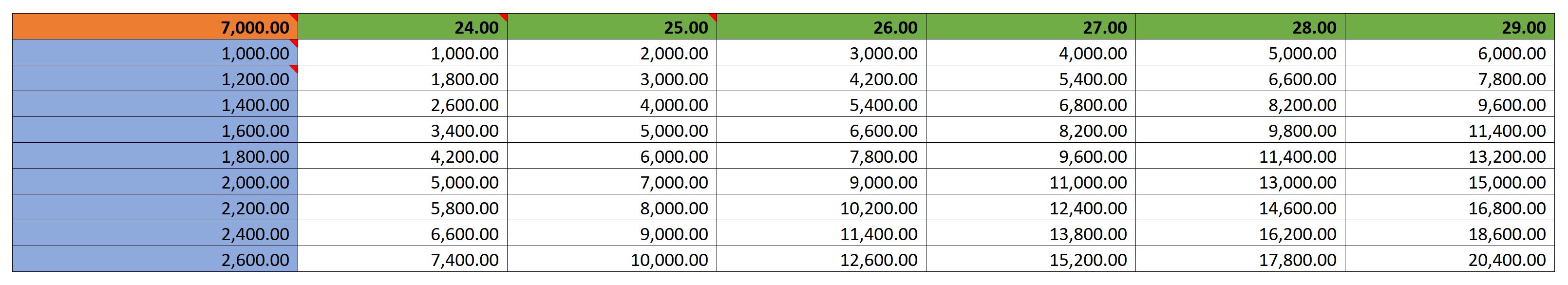
I have highlighted 2 areas in the matrix – Green and Blue. Green area is for the outcome, and the Blue area is for the decision variable range of values.

Input the formulas in the Green and Blue areas as shown below. This will help us build the Data Table for What-if analysis.

Matrix with Formula in Green and Blue area

Step 4

Finally, we come to the creation of Data Table.
Select the entire matrix from cells B11:E20, and then go to Data Tab, Select What-If Analysis in the Forecast section, and then select option for Data Table.

What-If Analysis > Data Table” class=”wp-image-124″/><figcaption>What-If Analysis > Data Table</figcaption></figure>


<p>You will get a “Data Table” dialog box, wherein you will need to input the Data Table arguments.</p>


<figure class=Data Table Dialog box
Data Table Dialog box

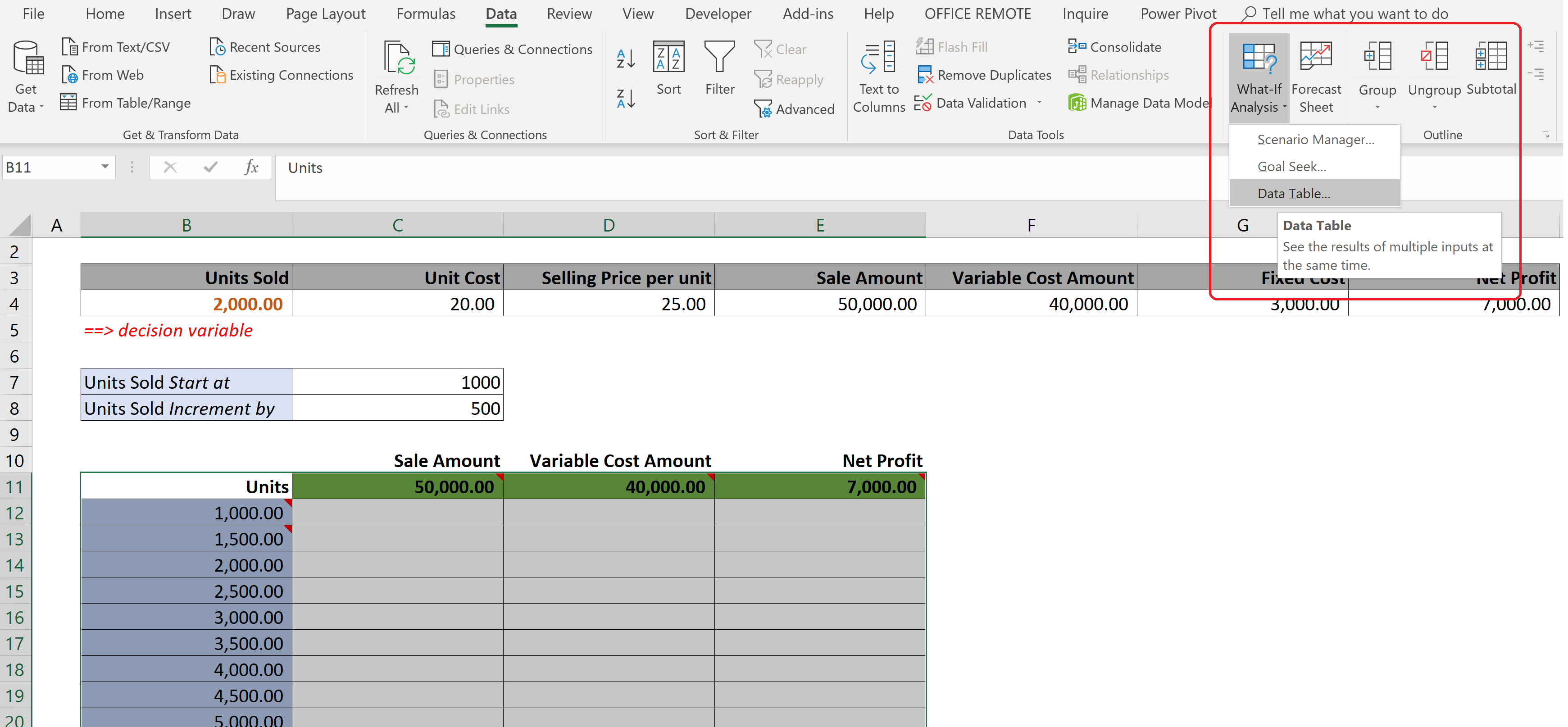
There are two arguments (1) Row Input Cell, and (2) Column Input Cell. These Data table arguments are not easily understood. So lets get a better understanding of these.

These two arguments can infact be mapped to the number of decision variables we are using for what-if analysis. In our example, since we are using only one decision variable i.e. “Units Sold”, hence we will need to input only one set of argument in the Data Table dialog box. This can be either Row or Column. Now, the question is which one should we choose.

This is where the color highlighting will help us. When we prepared our matrix, we have listed the range of values of “Units Sold” in the Blue area, which is infact a column range. This color coding will help us guide which Data Table argument to choose.

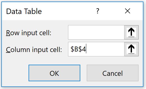
In our example, Row input cell will remain blank.
Column input cell: We will put in a reference to the decision variable from our original data set i.e. Cell Reference =$B$4.

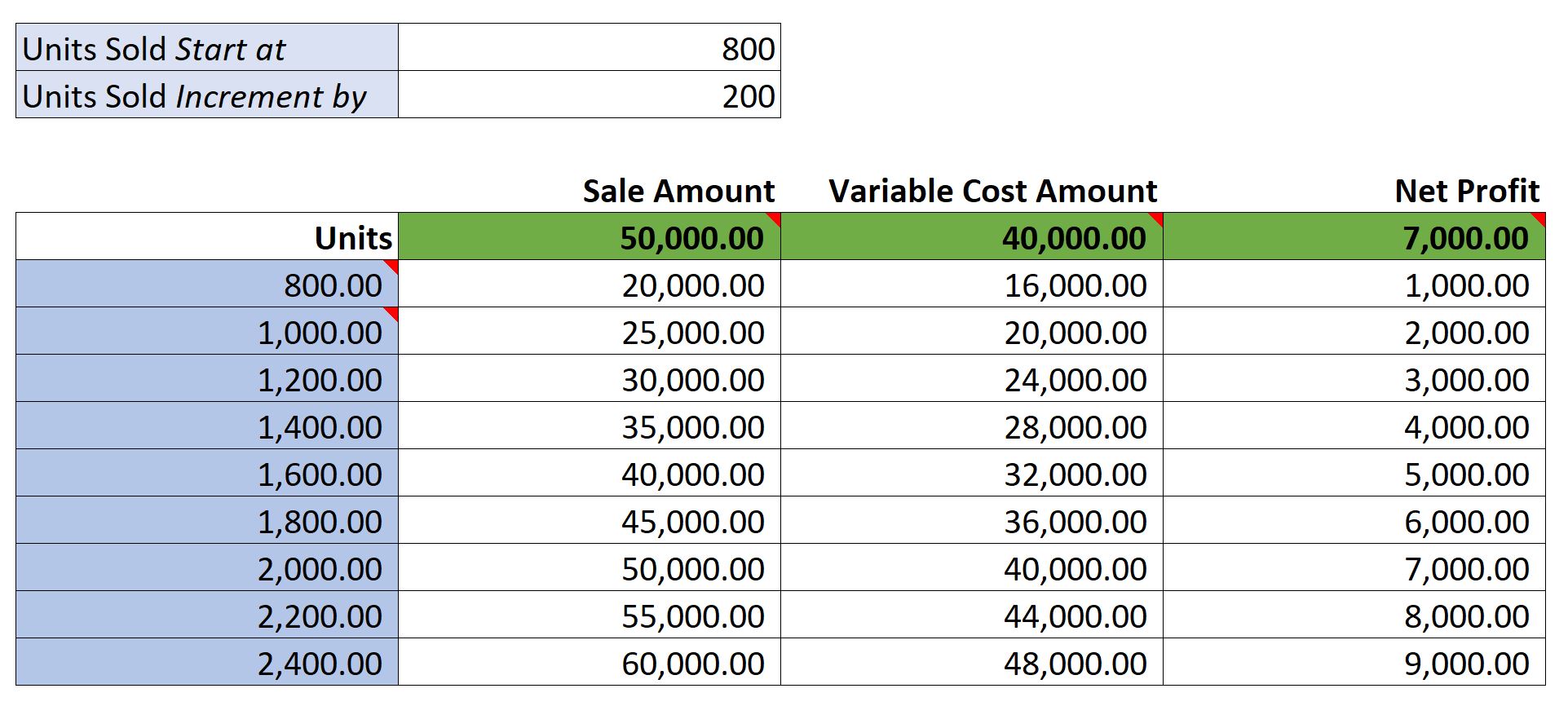
Hit OK, and Voila. Our Data Table is ready, and Matrix is populated with all the possible outcomes for our range of Units Sold.

Data Table is created based on input range of values

Coming back to Input Variable box that we had setup in Step 2 – so let’s discuss about that a bit. We had put in the following 2 arguments: “Units Sold Start at”, and “Units Sold Increment by”. Both provide additional flexibility in our Sensitivity analysis, where we can change these parameters any time, and see the Data Table refreshed based on our new set of range inputs for Units Sold.

For example, If I want to see the Units sold incremented by 200 units instead of 500, what will be the outcome. Vice Versa, If I needed to start the Units Sold at 800 Units and incremented by 200, what will be the outcome. Hope this is clear.

Data Table refreshes based on value changed in Input Variable Box

Two Variable Data Table What-If Analysis

Now continuing with the same example, suppose we wanted to see the outcome of Net Profit, based on two decision variables being “Units Sold”, as well as “Selling price per unit”.

Data Set for 2 Variable Data Table

Step 1

This time we will be setting up the Input Range, and Matrix as shown below.

Matrix for Data Table, as well as Input Variable Box

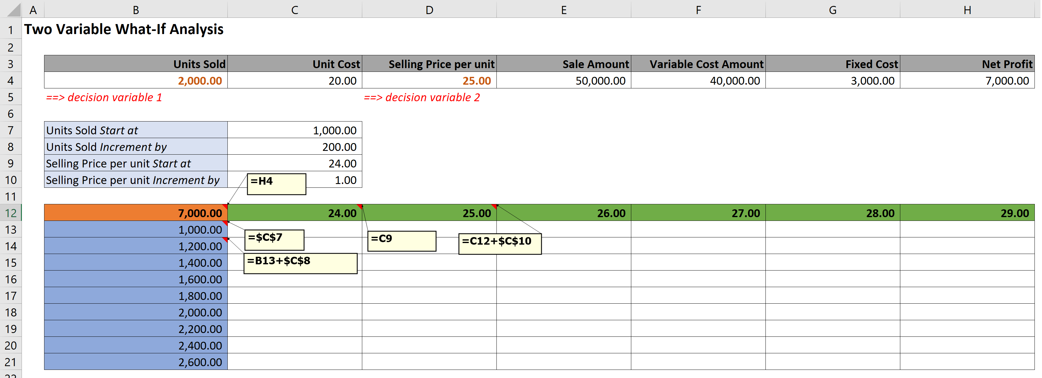
Remember, the Blue area (Column Area) is where “Units Sold” range of values are input. Green area (Row Area) is where the second decision variable – “Selling price per unit” range of values go. And the Amber highlighted cell is the outcome reference, for “Net Profit”.

Step 2

Select the entire matrix from cells B12:H21, and then go to Data Tab, Select What-If Analysis in the Forecast section, and then select option for Data Table.

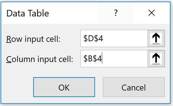
When you get a “Data Table” dialog box, enter Data Table arguments as below.
In our example,
Row input cell: Cell Reference of second decision variable, =$D$4
Column input cell: Cell Reference of first decision variable, =$B$4

Data Table Dialog Box

Hit OK, and our new Data Table is ready. The Matrix is populated with all the possible outcomes for our combination of range of Units Sold and Selling price per unit.

Data Table is populated, based on combination of input variables

Bonus

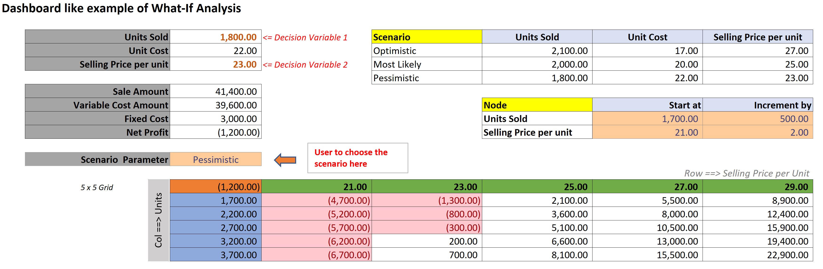
How could we make use of the above in the form a dashboard. In the below example, I have created a dashboard like scenario selection, which a user will choose, and depending on the scenario chosen be it Optimistic, Most Likely, and Pessimistic, it will update the values in the input variable box. This in turn will drive the outcome data table.

Dashboard like example

You can download the example file from the link. Also, don’t forget to visit my YouTube channel for many more video tutorials. Happy Learning !!

Pivot with Text

Gone are the days when you could pivot only with numbers!! Yes, with newer functionalities in Excel you can do pivoting with text as well. In this article, we will ponder upon how to make use of Pivot table to display text values. Pivot tables have been excellent, mainly for summarizing numbers. But, when it came to displaying text in the values area of a pivot table, there wasn’t much available until a DAX function was introduced called CONCATENATEX.

The DAX language has provided us with more possibilities than ever before. It allows for calculations that remained previously impossible. Calculated Fields and Measures are the new terminologies that one must get accustomed to when dealing with pivot tables with advanced functionalities.

Who can use whats described here:

  • Windows users using Excel 2016 or Excel 2010 to 2013 with Power Query add-in installed
  • Not available for MAC yet.

Lets first study an example, wherein one may need to have a text value show up in pivot area.

Assume a set of sales data by Sales representative and Product as below.

Data set for Pivot

Traditionally, when using Pivot to analyze the data, one could have summarized the above in the following manner:

Pivot by Sales Rep and Product

However, there was no way to include text values within the pivot area, to show up as below:

Product List as Text in Pivot area

Adding a Measure that uses CONCATENATEX function is what makes everything possible. This is what we are going to see in what follows.

The syntax for CONCATENATEX is (Table Name, Expression, Delimiter)

What becomes obvious from the above, is that, it is necessary to create a pivot table based on a source table, and not a range of cells. Next, Expression refers to the Column in the Table whose text values we intend to bring into the pivot area. Lastly, Delimiter is what separates the text values, be it a dash, comma, or a hyphen.

Follow the below steps in sequence to achieve the result of having Text values in Pivot area.

Step 1

Create a Table from the data set. Download the file with the dataset for ready reference. Place your cursor on any one cell in your data set, and then Go to Insert Tab, and choose “Table”. It will bring up a “Create Table” dialog. Select option “My table has headers”, and hit OK. By default, the table will be called Table1. Click on the Table Tools Design tab in the Ribbon and assign a new name for the table as “RepSalesData”.

Create Table from the Data set

Step 2

Go to Insert Tab, and choose “PivotTable”. This will bring up a dialog box “Create PivotTable”. Ensure Table/Range field shows up as “RepSalesData”. Choose “New Worksheet”, and most importantly, check the option “Add this data to the Data Model”, and hit OK.

Create PivotTable

Step 3

This will show up the Pivot Table Fields section on the right side of the screen. When your pivot table is based on the Data Model, you will see a difference in the Pivot Table Fields list. The name of the table will appear at the top of the fields from that table. Right-click on the name of the table “RepSalesData” and choose Add Measure.

Pivot Table Fields, Table shows up at the top of the Field list
Add Measure option

Step 4

You will get a new dialog screen “Measure” where the magic begins. Give a Measure name “Rep_Products”, and description. In the formula area, enter the below formula:

=CONCATENATEX(RepSalesData,RepSalesData[Product],”, “)

Define a Measure

Click on “Check DAX Formula” button. This will check for error in the formula entered. If there are no errors, it will display so. Choose “General” as the category for the Measure newly created. Note, for a text result, the only valid choice is General, so leave the selection as General. Hit OK to create the new Measure.

Measure is defined, Category chosen as General

Step 5

The new measure will not show up in the pivot table, instead it will show up as a new field in the Pivot Table Fields list. Start to build your pivot table by dragging fields to the Rows and Columns area. Drag the new field to the Values area. On the PowerPivot Tools Table Design Tab, turn off the Grand Totals for both Rows and Columns.

Step 6

Finally, you will see the Product list showing up next to each other in the “Rep_Products” column in the Pivot table.

Product List showing as Text values in Pivot area

However, if you observe closely, the last row in the pivot table shows up with iPhone X repeated twice. What this means is that the Sales representative has sold iPhone X twice in the given data set. If your intention is to only display the unique products sold by that Sales rep, you need to nest the VALUES function within CONCATENATEX function.

Step 7

Edit the measure we created above, and replace the below formula in lieu of the earlier one.

=CONCATENATEX(VALUES(RepSalesData[Product]),RepSalesData[Product],”, “)

With the VALUES function, duplicate values are removed, and only unique values are returned.

Unique Product List showing up as Text Values in Pivot area

Will also be updating my YouTube Channel with a tutorial video of the above example, and how to get the text value show up in Pivot. Keep watching, and send me comments.